Let’s Go Places: The Historical Meaning Behind the Toyota Logo

Branding is an essential aspect of running a business. For successful companies, mastering the idea of using details such as logos, colours, and other visual elements to create an identity for a product or service is a walk in the park.
In the case of Toyota, the three ovals elaborate on the car company’s history despite its apparent simplicity. Over the years, its public image has skyrocketed to one of the most known car brands in the world. But what is the meaning behind their logo?
1860: Sakichi Toyoda Establishes Toyota
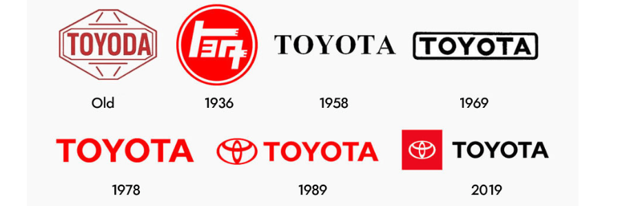
The Japanese car company's first name was originally spelt Toyoda, after its owner's last name. But its first problem was establishing an identity that introduced Toyoda as an automobile company. As a result, Sakichi designed a badge-type logo—also called Toyoda.
The logo was simple and easy to remember. It symbolized the company's clarity and dependability, shaped like a diamond. They also used a sans-serif font to display Toyoda alongside the diamond logo. Although the first, the diamond logo did not last long in circulation.
Sakichi had to change the company's name to Toyota from Toyoda. The change from D to T might not be too significant, but the change came from Japanese beliefs and culture. The word Toyota only took eight strokes to write, a sign of good fortune.
1949: Unveiling of Toyota's Second Logo
Compared to the first logo, its replacement alluded to the sun—represented on the Japanese flag. It carried a cultural meaning while serving as a solid identity for the company. Meanwhile, instead of the sans-serif font face, it featured the Japanese Katakana.
After redesigning the logo, Toyota decided to follow the trend of using a wordmark logo. It used Times New Roman font in capital letters against a white background. The company stuck with it for a while until it changed again in 1978.

1989: Toyota's 50th Anniversary
Toyota celebrated its 50th anniversary in 1989, which required a new logo. The company then asked their designers to create a logo they could use for a while, considering how the foreign markets would respond to how it looked and its recall. Until today, the symbol used to celebrate its 50th anniversary is still a logo used today.
However, the launch of Toyota's flagship luxury model in the same year needed another logo. In comes the three-oval logo, which future car models got afterwards. But before they were on almost all Toyota units, it first appeared on the Toyota Celsior, the first of its kind from their flagship luxury line.
2005: The Modern Toyota Logo
In 2005, Toyota updated its logo, but not by much. The three oval-shaped symbols were a little more streamlined, with the outer oval being smaller than the inner oval. The three ovals were also joined together in the center, and the word "TOYOTA" was placed on top.
The inner oval is the symbol of the customers, which the company is focused on. It represents Toyota's trust in its customers and its commitment to providing them with the best experience.
The middle oval is the symbol of the company itself. It represents Toyota's heart and soul and how it is a company that values its people. The outer oval is the symbol of the world. It represents Toyota's commitment to being a good corporate citizen and its desire to make a difference in the world.
Conclusion
The Toyota logo is one of the most recognizable in the world. It is simple yet effective and tells you everything you need to know about the company. Toyota is a company focused on its customers and making a difference in the world.
Here at Whitehorse Toyota, we’re dedicated to embodying everything the Toyota brand stands for. Here we want to make car buying easy and create a car shopping experience that considers every client’s budget, needs, and time. Stop by our lot today to reserve your next Toyota vehicle or to check out our new service centre.